Introduction
I am very excited to announce that Windmills Media has rebranded the studio with a new brand identity, including a new logo, new brand-specific fonts and an updated colour scheme. This rebranding reflects my desire to establish a more permanent and distinctive brand identity that showcases the expertise and creativity in brand and web design. Windmills Media started out with a “temporary” branding identity that served its purpose very well for the time being, but I felt that it was time to upgrade the visual appeal and align it more closely with the studio’s vision and values. I worked on this rebranding project during some periods that I had available between client projects, and I am very happy with the results. I hope you like it as much as I do!
Overview
This rebranding project was driven by a purpose to create a brand that reflects who I am and what Windmills Media does as a web and brand design studio. I wanted to convey the key characteristics of being fun, creative and professional in every aspect of the visual identity. The goal with a newly designed logo was to create a minimalistic and modernistic representation of windmill elements, to stay true to the Studio’s name and which symbolize our ability to generate fresh and innovative ideas for various media platforms. The new brand font was envisioned as a bold, fun, creative and clean typeface that stands out and expresses W.M’s personality. A fresh new brand colour scheme was planned as a bright, bold, fun and colourful palette that adds vibrancy and energy to the brand. Together, these elements create a cohesive and attractive brand identity that I am proud to share with audiences and clients.

Primary Logo
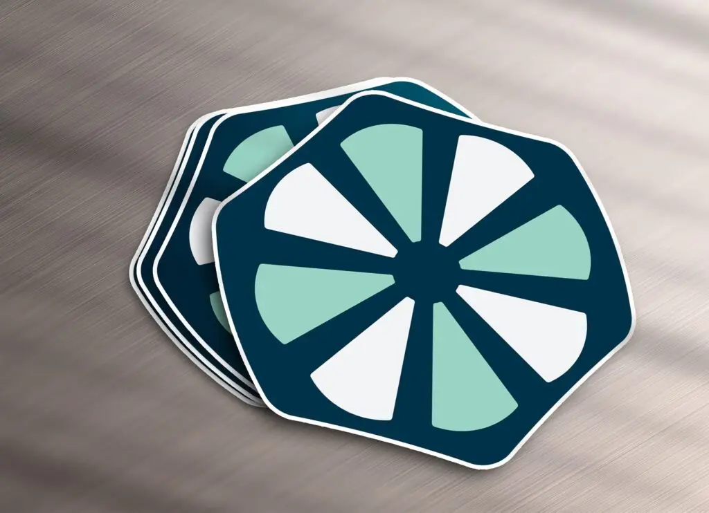
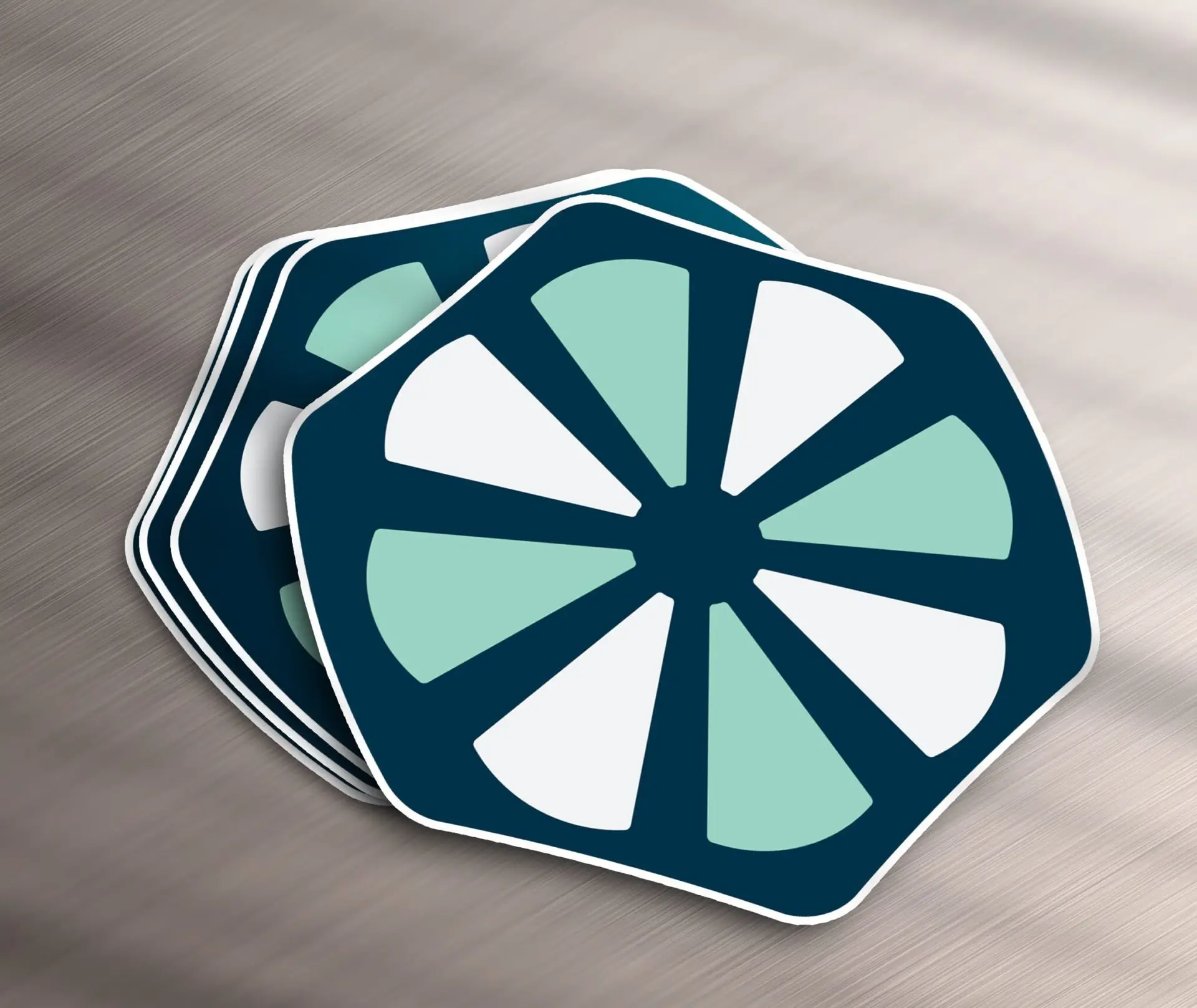
The primary logo is the core element of any visual identity. In the case of Windmills Media, it represents the studio name and the expertise in web and brand design. The logo consists of a dark blue hexagonal badge with curved sides, which frames eight lightly coloured minimalistic windmill blades in a circle, creating a contrast and a dynamic effect. The logo is inspired by our studio’s mission to generate fresh and innovative ideas for various media platforms. The hexagonal badge combined with the impression of negative space provided by the blades also resembles a classic media or film roll, which hints again at the studio name as well as my experience in media design. The logo is versatile and adaptable, as it can be used in different sizes, formats and backgrounds. It can also be combined with the brand name or used as a standalone symbol. The logo is simple, elegant and memorable, and it reflects our brand identity and values.

Secondary Logo
The secondary logo is a variation of the primary logo, with some additional elements that enhance the Windmills Media brand identity and communication. It uses the same dark blue hexagonal badge and the same modernistic and minimalistic windmill blades as the primary logo, but with some modifications. The windmill blades icon are scaled down and shifted up, creating a space for our studio name and slogan, which are written in a bold, creative and professional font. The studio name has a creative negative space border/place holder around it that compliments the shape of the badge. Placing the studio name at the center of the badge makes it the focal point of the logo. The secondary logo is a more detailed and descriptive version of the primary logo, and it can be used in situations where I want to convey more information and personality about the studio. The secondary logo is also versatile and adaptable, as it can be used in different sizes, formats and backgrounds. The secondary logo is a powerful and expressive representation of the brand identity and values.

Brand Fonts
Our brand identity is based on the fonts we use: Pusia Bold, Montserrat, and Poppins.
Pusia Bold is our main logotype font. It is a modern and elegant sans serif font that has a distinctive and dynamic look. It is perfect for creating a memorable and impactful logotype.
Montserrat is our secondary font. It is a geometric sans serif font that is inspired by the urban typography of Buenos Aires. It is a clean and minimalist font that creates a contrast with Pusia Bold. It is also a friendly and approachable font that conveys a sense of warmth and trust. We use Montserrat for headings, subheadings, and captions.
Poppins is our tertiary and text-body font. It is a rounded sans serif font that is designed with geometric forms in mind. It is a playful and lively font that adds a touch of personality and charm to our brand. It is also a legible and readable font that works well for long texts and paragraphs. We use Poppins for our website, blog posts, and other written content.

Brand Colours
One of the most important aspects of brand design is your choice of brand colours. I wanted to create a visual identity that reflects the values, personality, and style of Windmills Media. The brand colour scheme is inspired by the natural elements of water, earth, fire, and air. Here is the creative reasoning behind each colour:
Prussian Blue: This is the primary colour, representing water and wind. It symbolizes trust, loyalty, and professionalism. I chose Prussian Blue to convey reliability, expertise, and quality of work. Prussian Blue is a deep, rich, and elegant shade of blue that has a history of being used in art, military, and fashion. It also evokes the image of a clear sky and a powerful windmill.
Sea Foam Green: The secondary colour, representing earth and media. It symbolizes growth, freshness, and sustainability. Sea Foam Green is used to convey creativity, innovation, and environmental awareness. Sea Foam Green is a light, soothing, and calming shade of green that has a natural and organic feel. It also evokes the image of a lush landscape and a vibrant media industry.
Mauvelous: This is Windmills Media’s accent colour, representing fire and passion. It symbolizes passion, energy, and excitement. Mauvelous conveys to our clients enthusiasm, confidence, and boldness. Mauvelous is a bright, playful, and modern shade of pink that has a youthful and fun appeal. It also evokes the image of a fiery sunset and a passionate team.
Dandelion: This is a highlight colour, representing air and light. It symbolizes brightness, optimism, and happiness. Dandelion is used to convey friendliness, positivity, and fun. It is a warm, cheerful, and sunny shade of yellow that has a cheerful and uplifting effect. It also evokes the image of a fluffy dandelion and a radiant light.


