
Miscellaneous Brandmarks, Icons + Graphics
Project
Information
The Client
This selection showcases a collection of miscellaneous logos, icons and graphics that were created for a number of smaller clients, ranging from local businesses, organizations and events, to online businesses and more. These clients had diverse needs and preferences, but they all wanted to have a unique and memorable visual identity that would reflect their brand values and personality.
The Challenge
The main challenge for this project was to design logos, icons and graphics that would suit the different styles and themes of each client, while also being consistent with the overall aesthetic of the company/organization. Some clients wanted minimalistic and modernistic logos, some wanted badge-style logos, and some wanted letter mark logos. I had to balance simplicity and creativity, as well as functionality and appeal, in order to create effective and attractive designs.
Project Vision
The vision for this project was to create a portfolio of logos, icons and graphics that would demonstrate my versatility and skill as a designer, as well as the quality and professionalism of the company I was designing for. The goal was to showcase the ability to adapt to different client needs and preferences, as well as creating original and eye-catching designs. I wanted to highlight the importance of visual communication and branding in today’s competitive market.
The Results
Deliverables

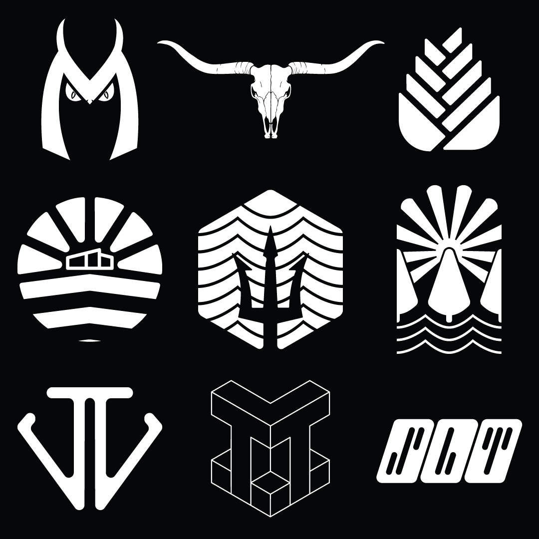
This selection features a set of logos and graphics that were inspired by nature and animals. These designs were created for clients who wanted to have a simple and elegant visual identity that would reflect their connection to the natural world. I focused on using minimalistic shapes, colours, and fonts to create logos and graphics that would capture the essence of each animal or element of nature. Some examples of these designs are:
– A logo for a company called Moon Owl that consists of a curvy ‘M’ with horns on the top corners and the leery eyes of an owl underneath. The logo uses a dark colour scheme to evoke a sense of mystery and wisdom.
– A graphic that depicts a custom longhorn bull skull icon/graphic with 2 thumbs up hidden in the eye sockets. The graphic uses a brown and yellow colour scheme to convey a sense of nature and confidence.
– A minimalistic and geometric rose bud logo. The logo uses a pink and green colour scheme to express a sense of beauty and freshness.
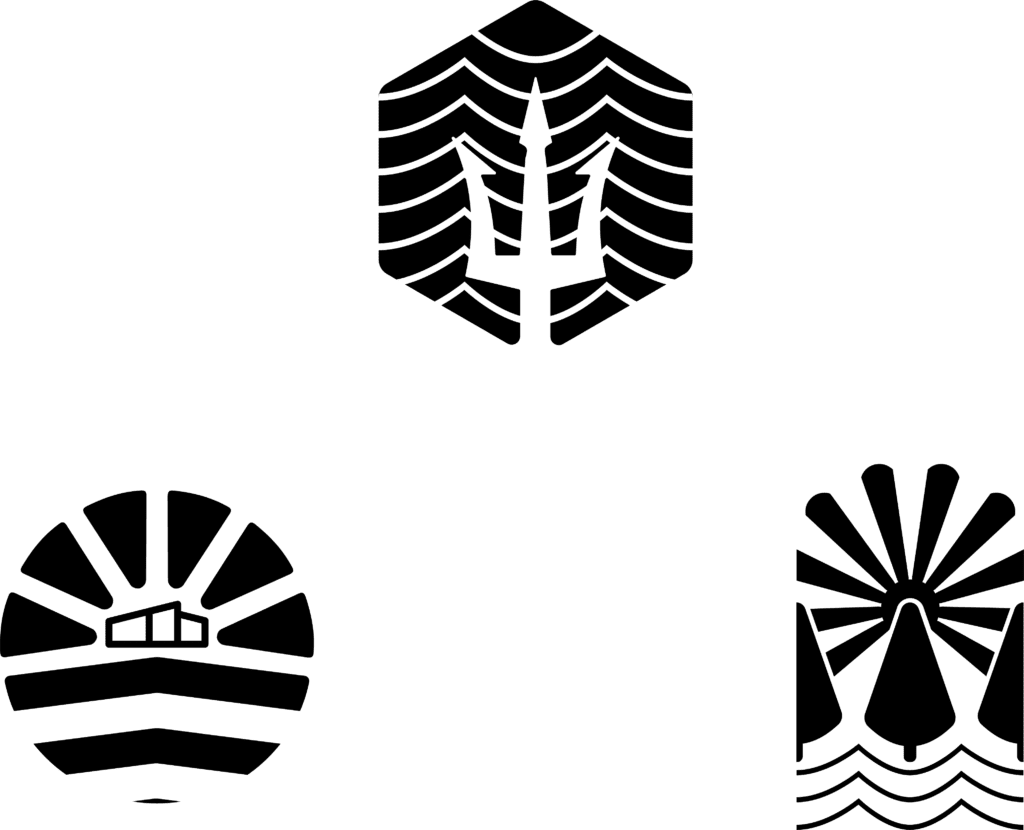
This selection features a set of logos that were designed in a badge-style format. These designs were created for clients who wanted to have a vintage and retro visual identity that would evoke a sense of nostalgia and authenticity. Utilizing basic geometric shapes, negative space, and contrasting colours, the aim was to create logos that would stand out and attract attention. Some examples of these designs are:
– A logo for a modern construction business that shows a minimalistic, geometric and abstract mountain with sunshine behind a modern home structure in the centre. The logo uses a blue and orange colour scheme to represent the harmony between nature and technology.
– A badge that shows a hexagonal badge with a trident in the centre and a series of horizontal negative space waves from top to bottom. The badge uses a black and white colour scheme to symbolize the power and elegance of the sea.
– A badge titled “Tree House” that shows a rectangular badge with a tree in the centre, half trees on either side ended by the edge of the badge, wave lines underneath, and sun rays shining from behind the centre tree. The badge uses a green and yellow colour scheme to illustrate the fun and adventure of living in a tree house.
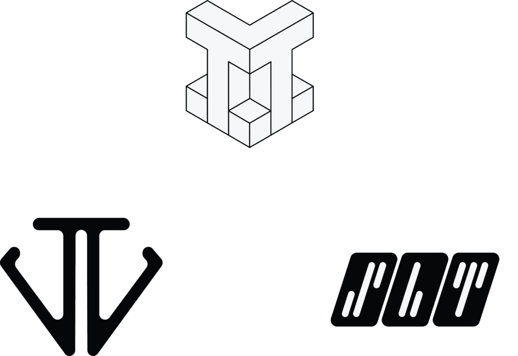
This selection features a set of logos that were based on letters and typography. These designs were created for clients who wanted to have a modern and sleek visual identity that would emphasize their brand name and initials. Using creative fonts, shapes, and colours, the goal was to create logos that would convey the personality and style of each brand. Some examples of these designs are:
– A logo that shows back to back “J’s” connected across the top arms, and in the shape of a diamond. The logo uses a gold and white colour scheme to represent the elegance and luxury of the brand.
– A logo for a gaming platform that shows isometric “TT” with periods on either side of the T’s and in the middle (.T.T.). The logo uses a blue and green colour scheme to suggest the fun and innovation of the platform.
– An abbreviated logo for a client named “Slate” that shows 3 squares angled to the right with “S” “L” and “T” inside of the boxes as negative space, in very abstract styles of typography/shapes. The logo uses a gray and black colour scheme to imply the professionalism and reliability of the brand.
I updated the logo for Triple K Farm, a cow farm in Avonport, Nova Scotia. The original logo was a little outdated, and the lovely folks at the farm wanted a more modern and professional version of it. We stuck with the bull silhouette in grass, a nice reminder of Triple K’s first bull. The new logo is simple, elegant, and versatile. It represents the farm’s identity and values, and attracts the desired customers.