Rock On! Climbing Co.

Get Your Rock On!

Project

Information

The Client

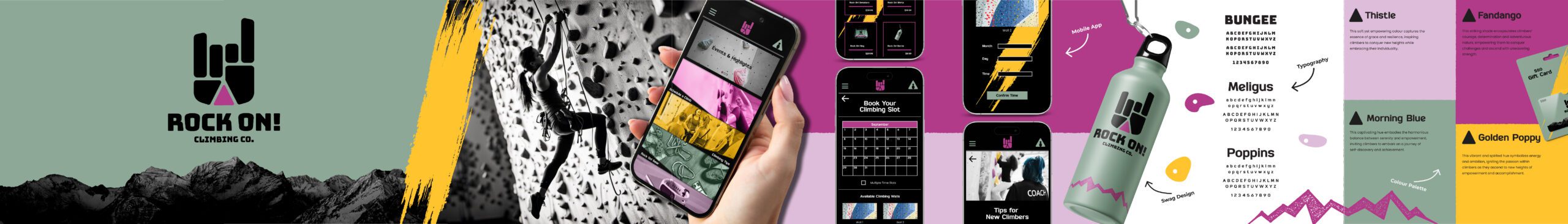
Rock On! Climbing and Fitness, a thrilling start-up by a pair of fitness enthusiast sisters, and aimed at women, younger teens, and kids, envisioned creating a safe, welcoming, and empowering space for climbers of all ages. They approached Windmills Media with a dream of establishing a brand identity that would resonate with their target audience and inspire investors. Their goal was not just to offer rock climbing experiences, but to foster a sense of empowerment and community among those looking to embark on vertical adventures.

The Challenge

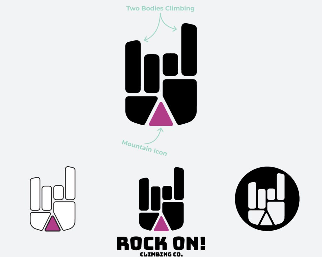
Among the unique challenges in designing for a brand like “Rock On!”, we needed to balance a playful, approachable design for kids with a more mature, inviting design for women and teens. Safety was paramount, requiring clear communication and a sense of security. Moreover, in a competitive market, the challenge was to make “Rock On!” stand out as a unique destination that celebrated inclusivity and adventure.

Project Vision

The main vision here was to create a brand identity that would reflect the heart-pounding excitement of rock climbing while maintaining an atmosphere of inclusivity and safety. I prioritized the goal of inspiring confidence and adventure in climbers of all ages, backgrounds and experience levels. The designs would convey the idea that Rock On! wasn’t just a climbing gym but a gateway to thrilling experiences, personal growth, and connection to a supportive community.

The Results

Deliverables

With this project, we wanted to demonstrate the power of design that might help transform a start-up into an inclusive and exciting destination for adventure enthusiasts. I was extremely honoured to have played a role in Rock On!’s mission to empower women, teens, and kids through the thrill of climbing and fitness.
For Rock On! Climbing Co., I wanted to craft a dynamic and inclusive logo that speaks volumes. The hand in the traditional “rock on” gesture exudes enthusiasm and adventure, while the violet-coloured triangle nestled in the palm ingeniously symbolizes both a mountain peak and a rock wall grip. The intentional shaping of the hand’s sides to resemble two climbers ascending side by side perfectly captures the spirit of community and togetherness at the heart of this climbing gym, inviting women, younger teens, and kids to embark on their climbing journey, supporting one another every step of the way.
UI/UX design focused on creating an intuitive and engaging user experience for a mobile app. We emphasized user-friendly navigation, clear sign-up and booking processes, and interactive features that would appeal to younger climbers as well as their parents. The design also incorporated gamification elements to make tracking progress, setting goals and comparing performance exciting.
When it came to branded merchandise, including climbing gear and apparel, we combined adventurous graphics and vibrant colours with comfort and durability. Designs featured the logo prominently and showcased a range of sizes and styles to cater to climbers of all ages and body types. The packaging design echoed the brand’s excitement, creating a memorable unboxing experience for customers.